Konnect & Saka: Identity for a Community Rooted in Culture
Brand identity system for two sister initiatives of a private NGO supporting African immigrant communities across Europe. Each initiative is anchored in an Adinkra symbol, a West African visual tradition encoding wisdom, values, and collective memory, translated into a complete system covering logos, colour, iconography, patterns, social media, and collateral.
Designing for communities that have been made invisible
A European NGO supporting sub-Saharan African immigrant communities needed an identity for two core programmes: social integration and economic empowerment. The identity had to feel authentic to the communities it serves while remaining credible in institutional and funding contexts. It needed to carry cultural weight without becoming decorative.
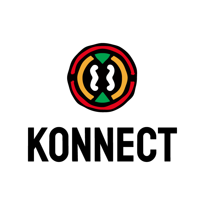
Konnect primary logo
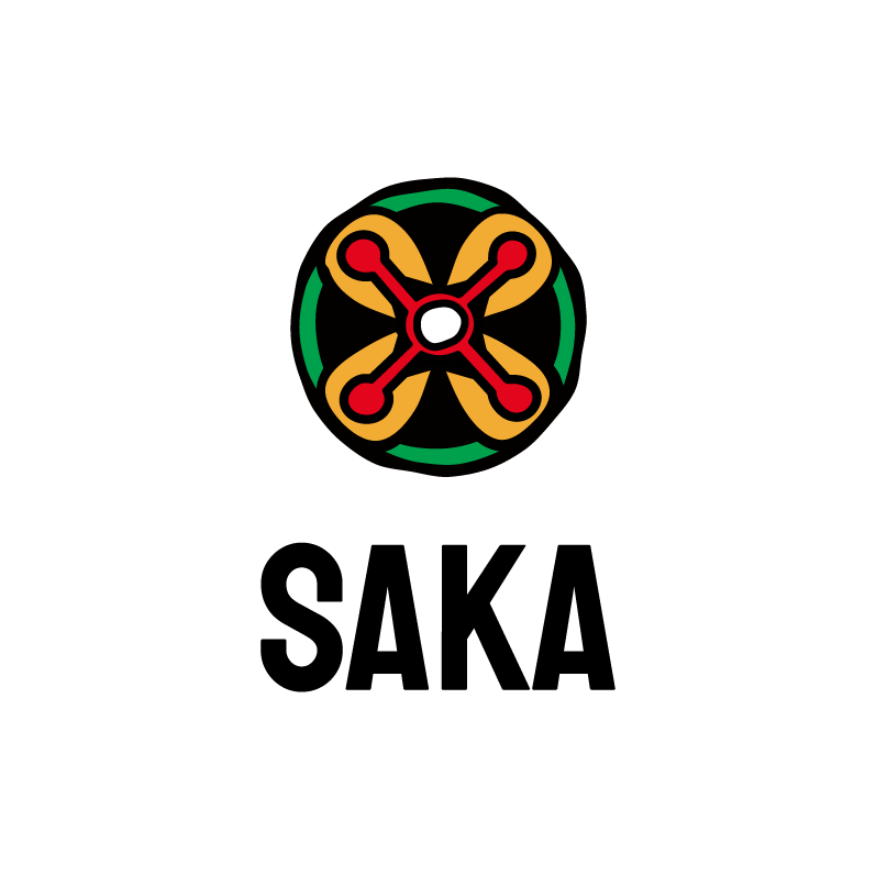
Saka primary logo
Adinkra as a design system, not decoration
The conceptual foundation is Adinkra, a visual symbol tradition from the Akan people of Ghana and Côte d'Ivoire. The symbols were chosen for their meaning, and that meaning shapes every design decision. The resulting system is warm, contemporary, and unapologetically African, designed to resonate with the communities it serves without falling into humanitarian clichés or generic global aesthetics.
Built on balance, meaning, and clarity
Both logos are constructed on an 8x8 modular grid derived from the geometry of their respective Adinkra symbols. Each colour within the mark carries a defined meaning. Proportions, clear space rules, and minimum sizes are documented for every application from 24px digital icon to 80px print lockup.
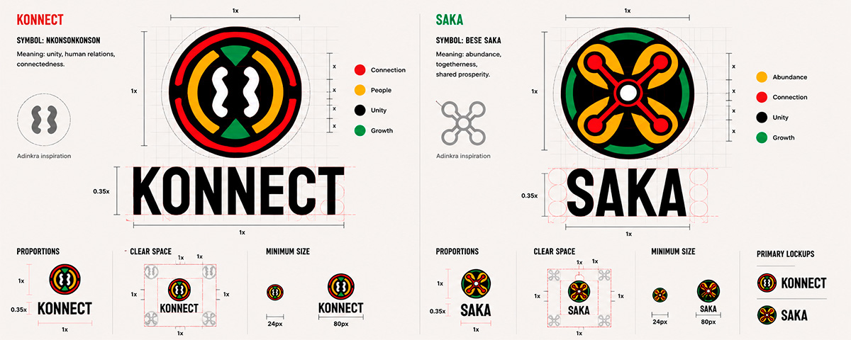
Logo construction grid for both initiatives: Adinkra inspiration, colour meaning, proportions, clear space, and minimum size specifications.
A palette drawn from West African visual tradition
Vermilion, Gold, Forest, Terracotta, Sand, and Sage form a shared palette rooted in natural pigments and textile traditions. Vermilion leads for Konnect, Gold for Saka. Usage ratios, tonal scales, and contrast pairings are documented to WCAG AA and AAA standards.
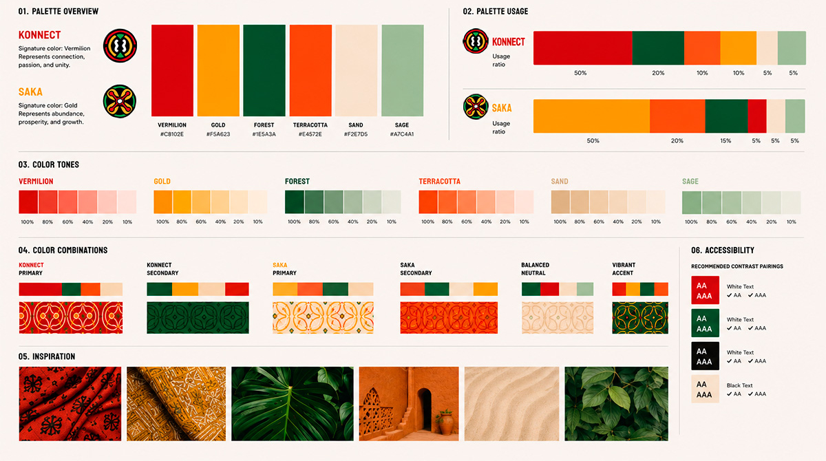
Color system: palette overview, usage ratios per initiative, tonal scales at 100 to 10%, colour combinations with pattern applications, and WCAG accessibility pairings.
Icons inspired by Adinkra symbols
Sixteen icons divided across both initiatives, covering service areas from Community and Employment to Financial Literacy and Economic Independence. Available in three styles: outline, filled, and badge.
Icon system: 16 icons across both initiatives in outline, filled, and badge styles.
Visual language inspired by Adinkra symbols
Some patterns form the graphic backbone: the Konnect Pattern (Nkonsonkonson, in Vermilion), the Saka Pattern (Bese Saka, in Gold), and a Combined Pattern for contexts where both initiatives appear together. Each has defined colorways and documented usage guidelines for print, digital, and merchandise.
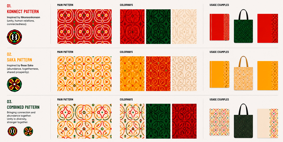
Pattern system: Konnect Pattern, Saka Pattern, and Combined Pattern, each with main pattern, colorways, and usage examples.
Consistent, impactful, and culturally rooted communication
Templates cover Instagram posts and stories, Facebook posts, LinkedIn banners, and WhatsApp cards. Each initiative has its own visual theme while sharing a common library of graphic elements and patterns, giving community managers a ready-to-use system that holds visual integrity without requiring design skills.
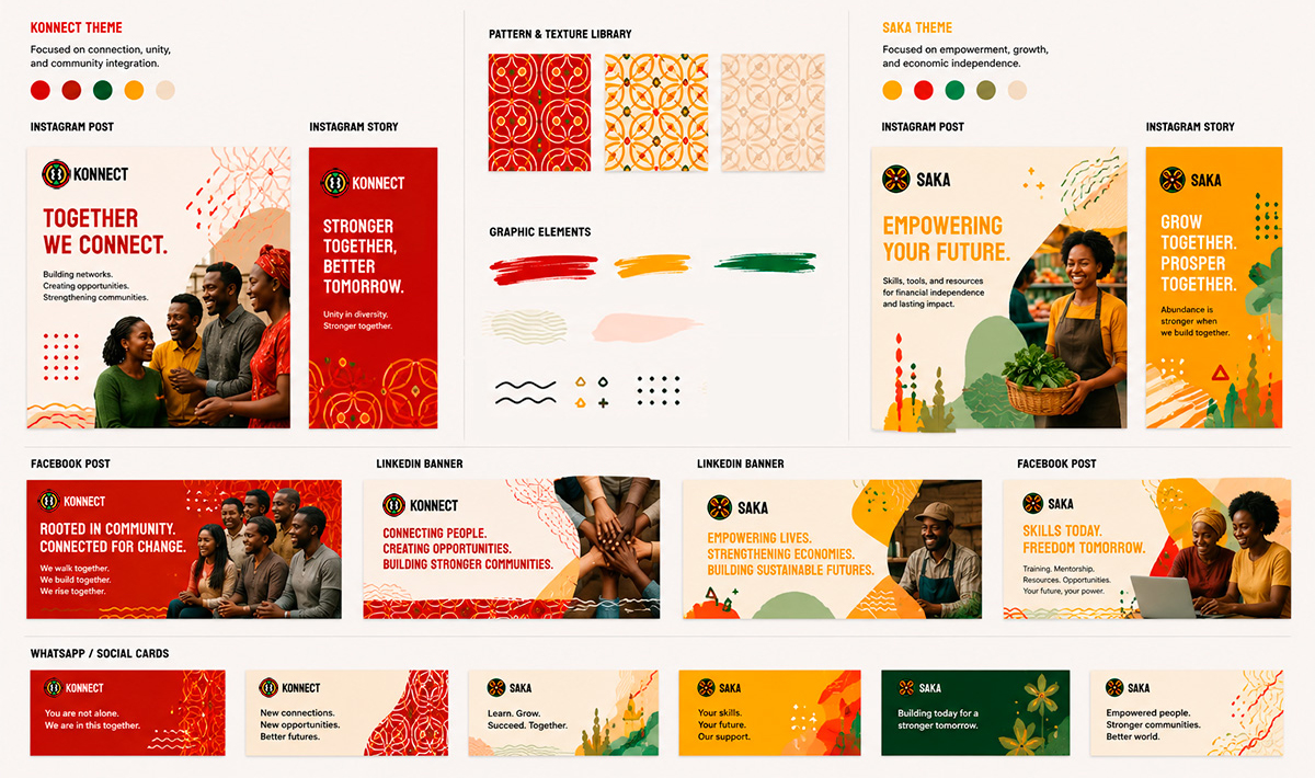
Social media toolkit: templates across Instagram, Facebook, LinkedIn, and WhatsApp for both initiatives.
The brand in pocket format
Stickers combining illustration, pattern, and copy in the brand's visual language. Konnect stickers focus on connection and belonging. Saka stickers speak to growth and economic independence.
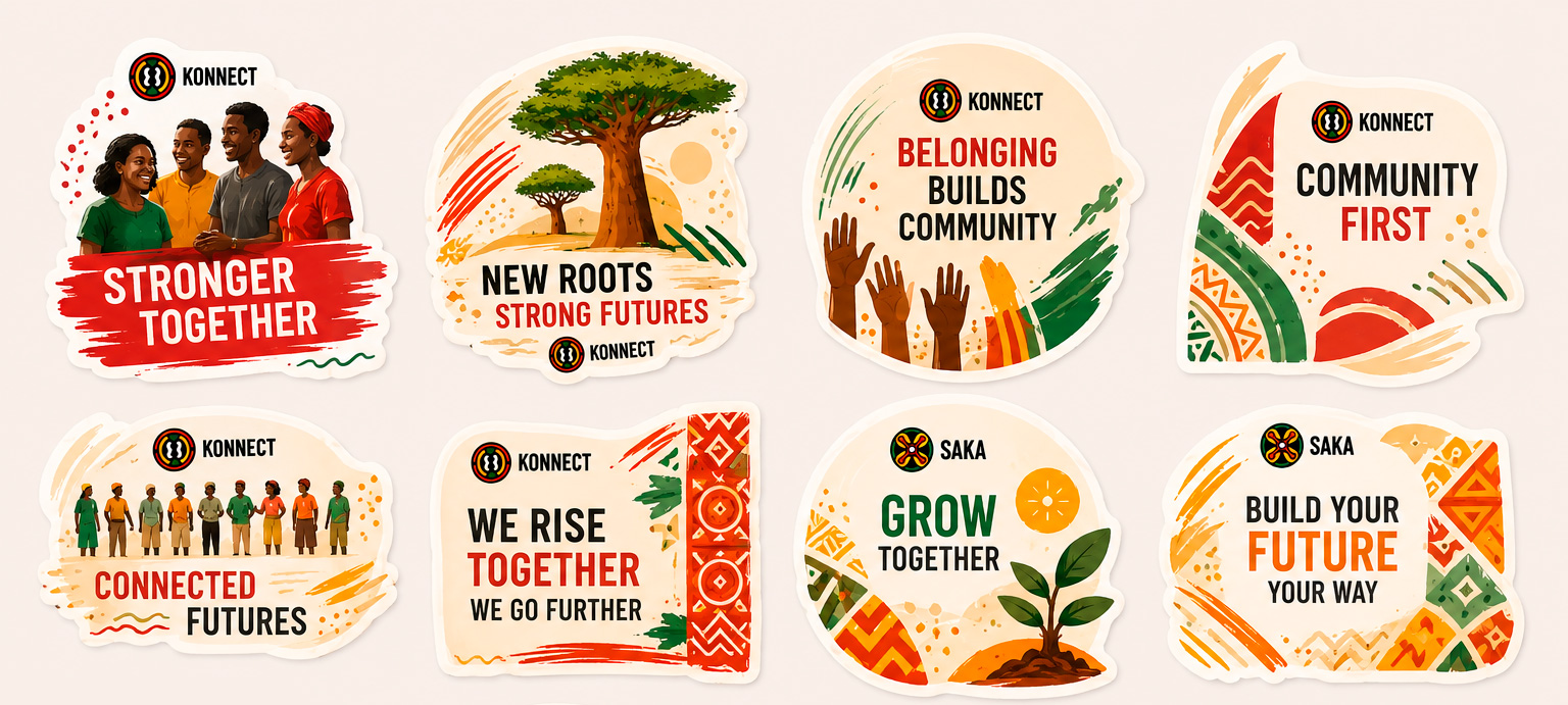
Sticker collection: designs across both initiatives, each a self-contained communication piece.
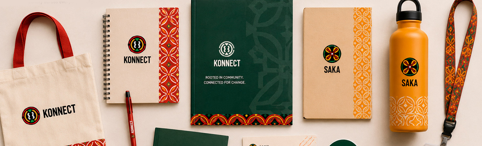
A consistent identity across everyday touchpoints
The identity extends across tote bags, notebooks, folders, water bottles, lanyards, pins, volunteer badges, and certificates of completion. Each object reinforces the system's cultural grounding and gives community members something they can carry with pride.
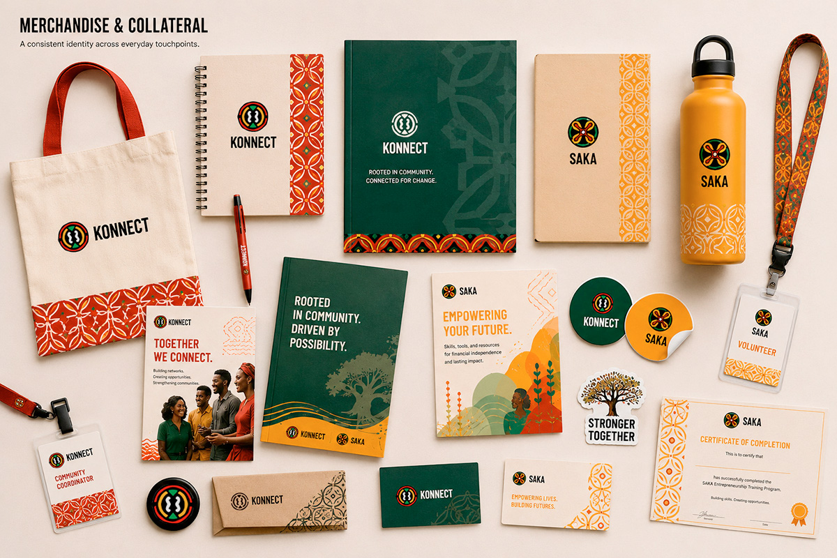
Merchandise and collateral: tote bags, notebooks, water bottle, lanyard, pins, volunteer badge, and Saka certificate of completion.
A complete system, fully documented
The brand manual covers sections from brand essence and logo construction to photography style, do's and don'ts, and brand promise. Built for independent use by the organisation's team without requiring ongoing design support.
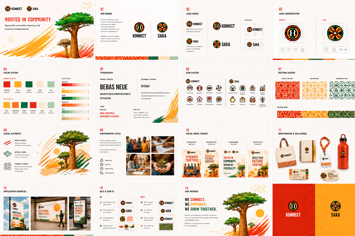
Brand manual overview: sections covering the complete system, built for independent use.
An identity that knows where it comes from.
A complete, culturally grounded brand system ready to live across digital and print. The brief was to build something the communities it serves would recognise as theirs, not a generic NGO aesthetic applied from the outside, but a visual language rooted in the same cultural tradition the organisation is built to support.
The system delivered that across every touchpoint, from a 16px favicon to a full merchandise line.