I hired myself as my own client.
Designing a portfolio for a designer with 25 years across industries, disciplines, and continents is harder than it sounds. This is how I approached it: brief, decisions, what broke, and what I'd do differently.

The hardest client brief I've ever written.
Problem
The challenge wasn't technical. It was editorial: how do you present 25 years of work across music touring, editorial media, enterprise UX, brand identity, and design systems, without reading like a CV, a portfolio template, or a generic AI-generated site?
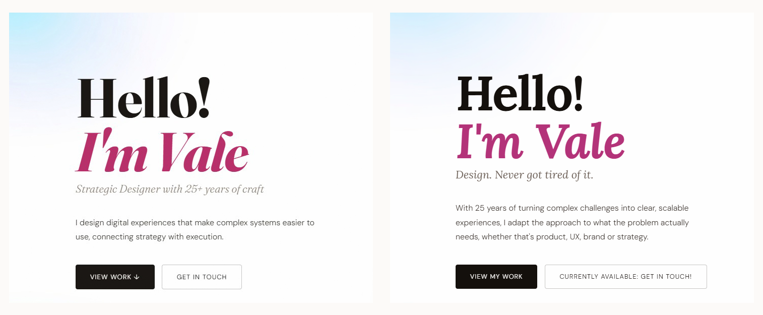
The first draft positioned me as a "Strategic Design Leader": language that reads as DesignOps management, not hands-on design. I rewrote it from scratch. The final positioning: Senior Designer, pragmatic, strategic, still hands-on. It reflects what I actually do and what makes me different from most designers at this level: I don't just direct, I build.
Users
Evaluate skills and experience quickly. Need to see range and level at a glance.
Assess strategic thinking and execution. Looking for someone who builds, not just directs.
Determine whether I'm the right partner. Looking for range, process, and clear communication.
Constraints
- 25 years of work across industries, disciplines, and countries
- Multiple projects under NDA
- Three languages, three markets: localized in tone, not just translated
- Built and maintained solo, no team, no CMS
- Zero paid plugins or subscription tools
Product Requirements
- ✓Work in 3 languages with localized tone, not machine-translated copy
- ✓Communicate NDA projects without password-protected case studies
- ✓Support both hiring and client acquisition from the same homepage
- ✓Meet WCAG 2.1 AA accessibility across all pages
- ✓Fully maintainable by one person with no CMS or plugin dependencies
How to position 25 years of experience without looking like a CV.
A single system that had to scale across languages, audiences, and NDA work
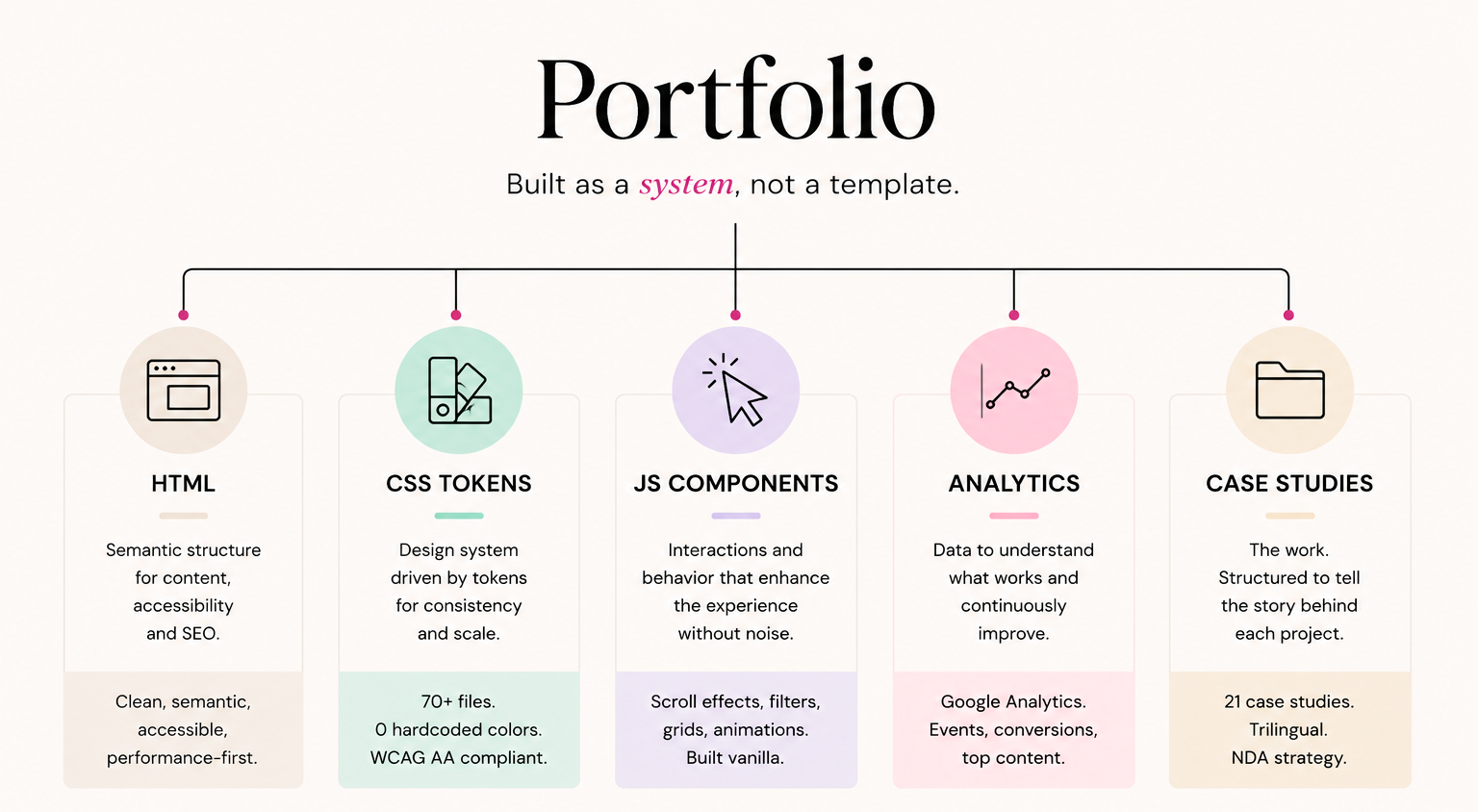
The portfolio wasn't designed as a collection of pages. It was designed as a system connecting positioning, design, implementation, content, and measurement.
Typography
The original type system used Fraunces for display and DM Sans for body. By early 2026, Fraunces had become the default font of AI-generated portfolios. I explored Newsreader, Gloock, Bodoni, Instrument Serif, each with legibility problems at small sizes. The final choice was Lora: warm, editorial, readable at all sizes, without the AI-portfolio association. The lesson: establish typographic tokens early. A global find-replace is fast; hunting edge cases is not.
From
Fraunces + startup portfolio aesthetic
To
Lora + editorial personality
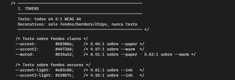
Color
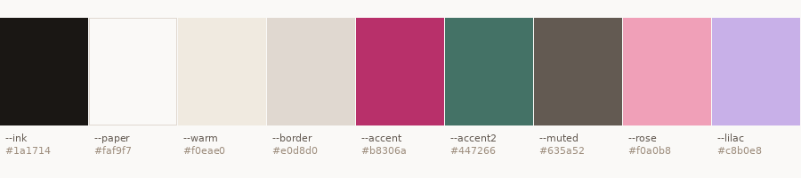
Cream background, near-black ink, magenta accent, sage green secondary. Every text color has its WCAG contrast ratio documented in the CSS token comments. Decorative pastels are explicitly flagged as non-text. The system spans 70+ files with zero hardcoded color values.
Single source of truth for color across the portfolio.
Code
Vanilla HTML, CSS, and JavaScript. No React, no Next.js, no Webflow. Full control over performance and behavior, and a direct demonstration that my implementation skills are real. The code has my fingerprints: doodle animations, a photo swap triggered on scroll, stats grids that collapse gracefully at tablet without a media query per component.
NDA
Most enterprise work is under NDA. The approach: representative visuals that communicate design decisions without revealing confidential assets, documented clearly with an NDA badge. This forced a useful constraint, the writing carries the weight. If you can't show the screen, you have to explain the decision clearly enough that the reader understands what was built and why. That's a better test of communication than a gallery of polished screenshots.
"That's a great portfolio format. I'm going to reference it when some people ask what I mean by homepage tiles that have value and how to show NDA work without a silly blocking password."
Greg Niejadlik, ADPList Mentor
This feedback mattered because communicating NDA work without hiding it behind passwords was one of the project's core design challenges. The comment validated the homepage tile format and the NDA strategy specifically, not the portfolio as a whole.
Not a generator. A thinking partner.
I used AI throughout the process in ways closer to having a senior design partner on call than to automating output. The distinction matters: the results only work if you know what you're evaluating.
Structured critiques from the perspective of a hiring manager, an agency creative director, and a potential client: three audiences with very different expectations. Each surfaced different gaps. The hiring manager flagged the positioning read as management; the client perspective flagged that services were buried.
A full WCAG 2.1 AA audit identified seven issues across contrast, keyboard navigation, heading hierarchy, and aria attributes, more systematically than a manual review. Fixes applied across all three language versions simultaneously.
Taglines, section titles, eyebrows, epigraphs, CTA labels, about copy, all went through multiple rounds of iteration. The value wasn't in the generated options but in the speed of elimination. Final copy in every case came from narrowing, reframing, and pushing back.
Also used for NDA representative visuals (briefed with interaction patterns and visual tone, not just "make something that looks like an app") and color and data visualization testing before touching the CSS. The decision was always mine; the iteration speed was not.
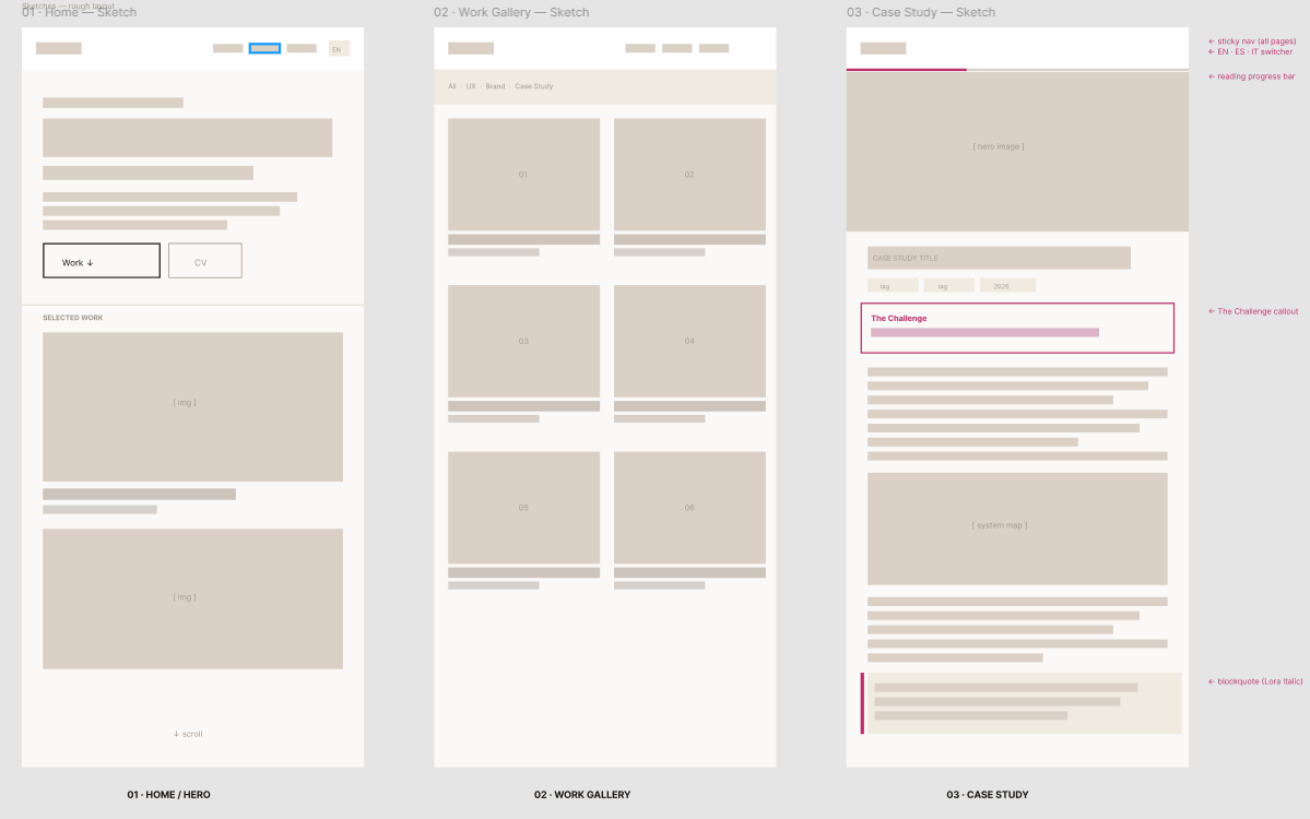
Three versions. One principle: ship, then improve.
Home page, work gallery, three case studies, contact. No polish, no microinteractions, no accessibility audit. The goal: go live with real URLs. Imperfect and public beats perfect and invisible.
Complete case studies, repositioning of the hero copy, skills section restructured, testimonials added. Trilingual versions (ES/IT) built out fully, localized in tone, not just translated. Analytics integrated from week one.
Full WCAG 2.1 AA audit and fixes. Typography migration from Fraunces to Lora across 70+ files. Copy refinement throughout. Doodle animations updated to reposition randomly each cycle. Photo swap on scroll. Spacing and type size adjustments across sections. Launch of this case study: the portfolio itself as a design project, documented and shipped. Reading progress bar across all case studies. A small UX detail that signals respect for the reader's time.
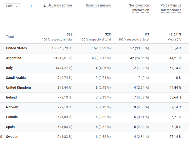
328 users. 10 countries. Still iterating.
Success wasn't measured by traffic. It was measured by whether different audiences could find what they needed.
Launched March 2026. Direct traffic dominates: people sharing the URL, not finding it through search. That says something about the network. Italy has the highest engagement time at 2 min 23 seconds. 5 CV downloads from the Experience section. The numbers are early; the system is built to grow.
What designing for yourself teaches you
Designing your own portfolio removes the one thing that makes design easier: distance. There's no client to push back on, no brief to anchor decisions, no external deadline to force choices. Every decision becomes personal and therefore harder to finalize.
Treating myself as a client helped: writing a real brief, defining a real audience, setting a real ship date for V1. The analytics from the first week told me more about what was working than months of deliberation would have.
The hours spent on a four-word tagline weren't a distraction from the design work. They were the design work.
Copy is design. The headline is the first thing someone reads; if it doesn't land, nothing else gets seen. That's true for every project I've delivered in 25 years. I just had no client to remind me of it this time.