Kiru: Brand Identity for a School Communication Platform
Kiru is an edtech platform connecting private schools, parents, and students in Buenos Aires. The project combines brand strategy with product thinking: a modular identity system where the symbol is the product architecture, and every design decision is grounded in real user needs.
Why this platform exists
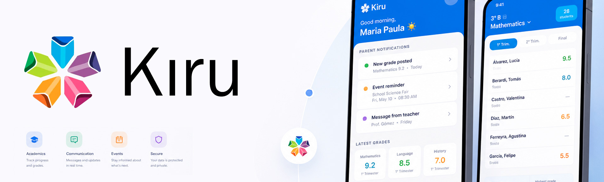
Private schools in Buenos Aires rely on fragmented communication: WhatsApp groups, emails, and paper notices. Kiru centralises grade reporting, notifications, and two-way communication between schools and families into a single platform. The identity needed to convey institutional trust for schools, clarity for parents, and a modern tone that signals a shift toward digital tools.
The symbol is the product architecture
Kiru is built on a modular origami system. Each module is an independent unit with a specific purpose. Together, they form one connected platform. The symbol encodes this directly: five origami units assembling into a single mark, one for each core feature.
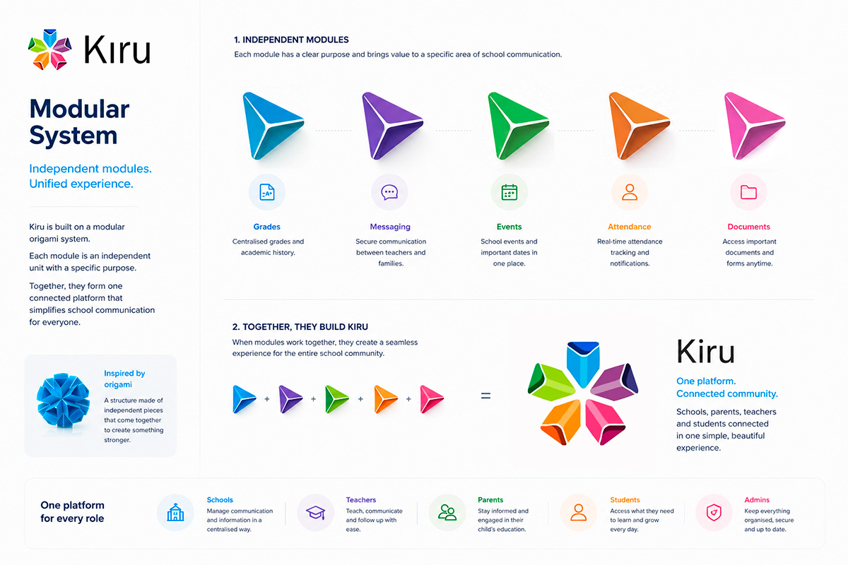
Five modules, one platform. Grades, Messaging, Events, Attendance, and Documents as independent units that assemble into the Kiru symbol.
Geometry grounded in origami mathematics
The symbol is constructed on a pentagonal grid using angles derived from modular origami geometry: 54°, 72°, 108°, and 126°. Every curve and proportion is intentional.
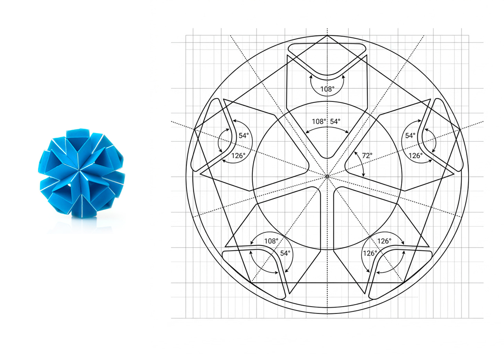
Construction grid — pentagonal geometry with defined angles (54°, 72°, 108°, 126°) governing every curve and proportion.
Designed for clarity and trust
Sky blue as the primary colour anchors trust and information. Each module colour maps to a content type, supporting instant recognition across the interface. Built to WCAG 2.1 AA standards.
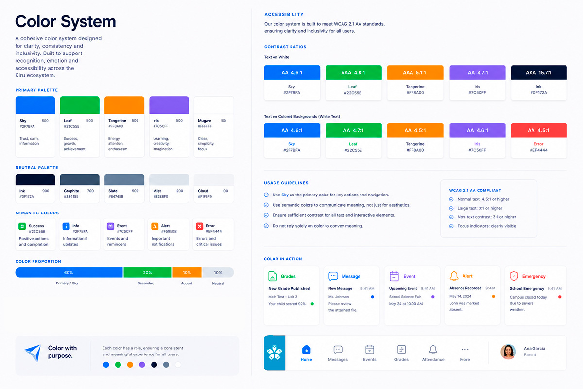
Colour system: primary palette, semantic colours, usage ratios, WCAG 2.1 AA contrast values, and colour in action across UI components.
Recognition at every size
The symbol holds its clarity from 20px to 120px, tested across iOS and Android in light and dark environments.
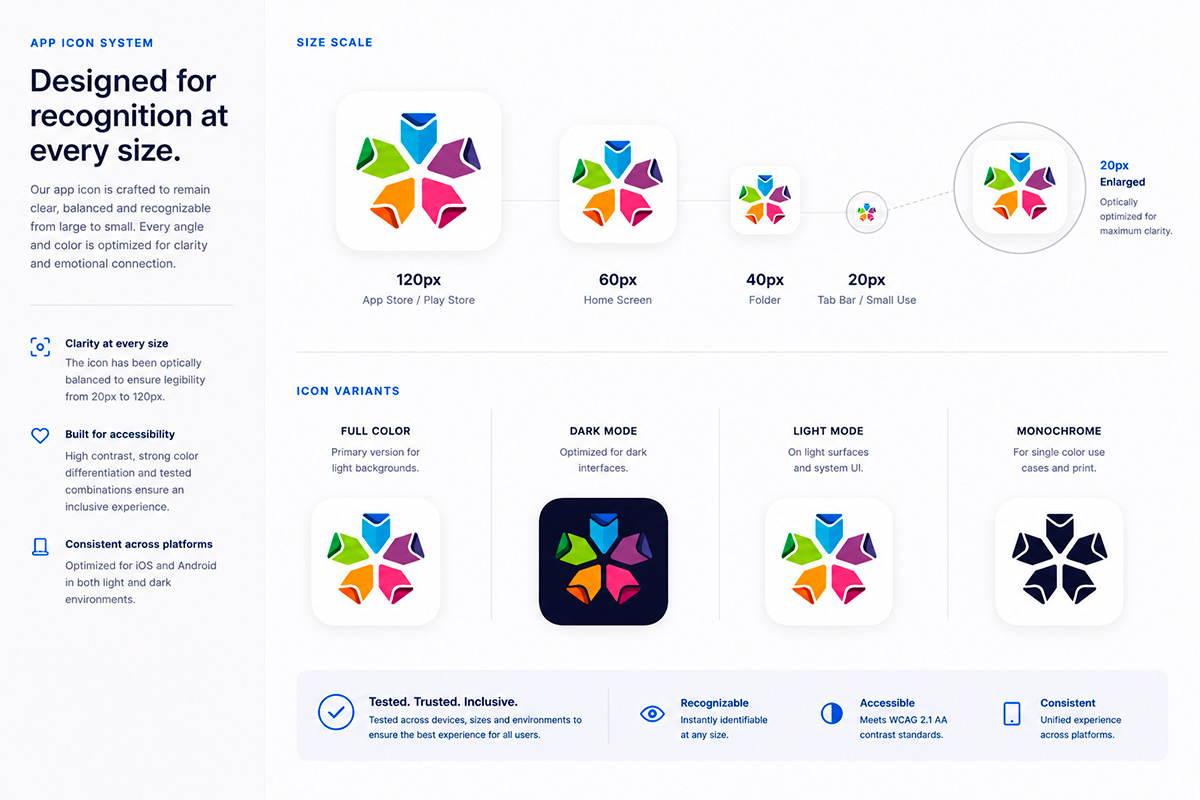
App icon system: size scale from App Store to Tab Bar, and four variants for every surface and platform.
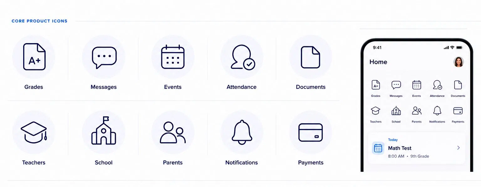
Core product icons
Ten icons covering the platform's core areas, designed for consistency across mobile navigation and feature access.
Core product icons in context on the home screen.
Representative product screens
Three core interactions: the parent dashboard, grade management, and teacher-to-parent messaging.
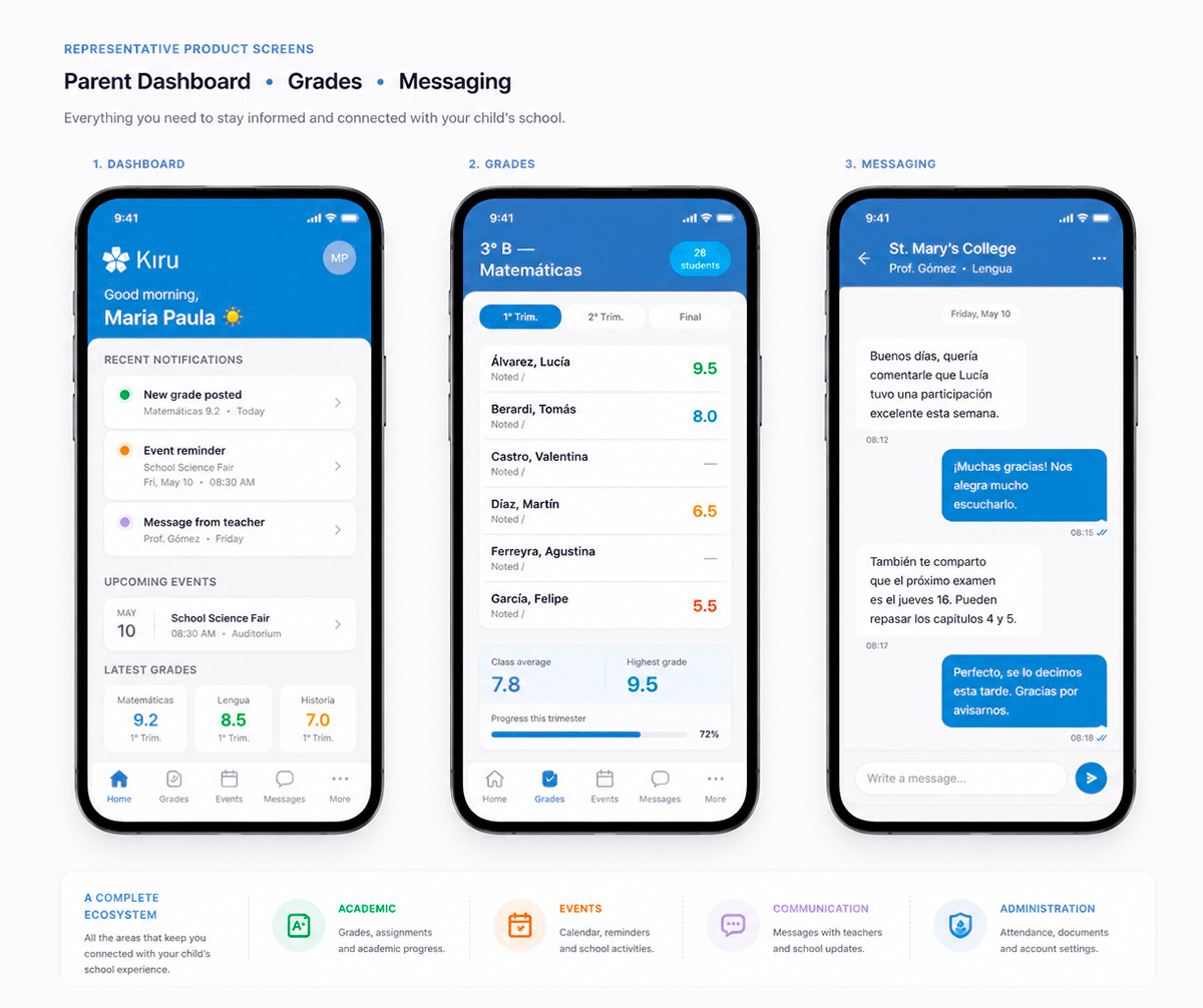
Parent dashboard, Grades, and Messaging.
Clear. Consistent. Contextual.
Every notification follows a unified structure with category colour coding, priority levels, and defined behaviour across iOS and Android in both light and dark mode.
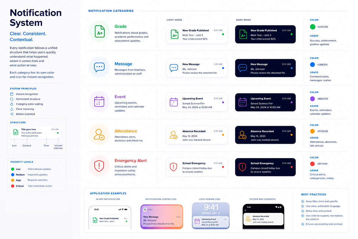
Notification system: five categories, light and dark mode, priority levels, and application examples across iOS lock screen, notification centre, and Android system bar.
Connected from the first message
Responsive email templates covering the full parent journey: welcome and account activation, grade updates, event reminders, and teacher messages. Designed for desktop and mobile, accessible and school-branded.
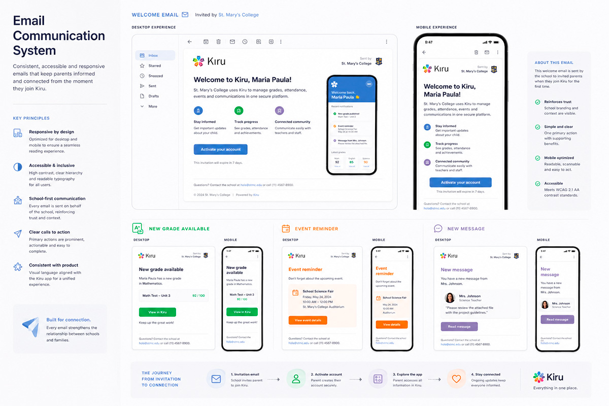
Email system: welcome email on desktop and mobile, three transactional templates, and the four-step onboarding journey from invitation to connection.
Building consistency. Creating clarity.
A unified component library covering foundations, buttons, inputs, cards, notifications, tags, avatars, status indicators, navigation, and spacing. Built for accessibility and scalability across iOS and Android.
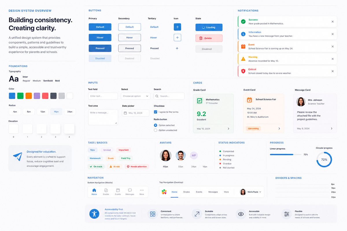
Design system overview: foundations, components, and patterns built to WCAG 2.1 AA standards.
Grounded in user conversations
The initial discovery included interviews with parents and school administrators, user mapping, and analysis of communication flows. Conducted alongside a colleague over four months.
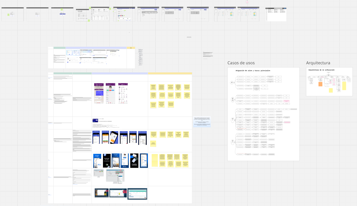
Discovery board: user interviews, flows, and communication mapping.
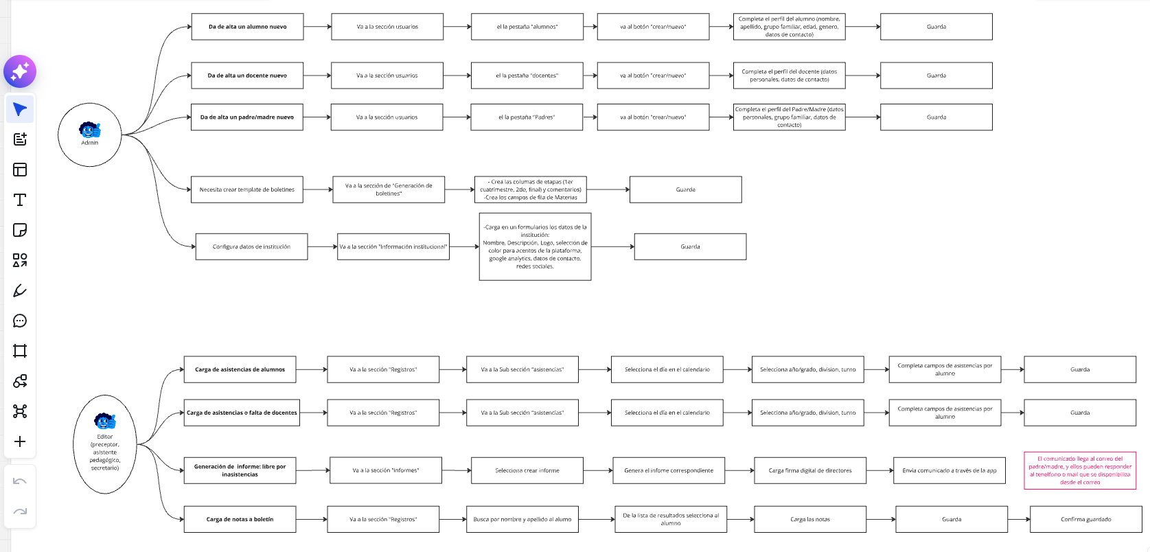
User flow detail
Brand ready. Platform in progress.
Kiru is still in development. The system is complete: brand, product UI, design system, notification framework, and email system, all built to scale from pilot to full deployment across Buenos Aires private schools.